New look ninehertz
-
-
 Amy B
Amy B -
Thanks for the feedback Pete. I agree that Live Dates could be better, I have some ideas how to improve it but I think it'll have to be left for a later release - the plan this time is to keep evolving the site rather than leaving it for several years between updates.
Logo design is a bit beyond my design skills, hence the simplistic typographic logo (and I quite like the guardian ), but it's definitely something we can look into developing later on.
 -
[20:11 on 29/01/13]
-
-
-
 Amy B
Amy B -
...and it's live (as you'll probably have noticed if you're reading this).
ninehertz is going to be continuing to develop so keep letting us know your ideas for the site and if you spot any bugs. -
[19:02 on 30/01/13]
-
-
-
 Gareth
 - Waaah! Change! Waaah!
-
[22:43 on 30/01/13]
-
-
-
 Ramo
Ramo -
^ thats what i thought ha ha
Personally i think it lacks a bit of character now that it's all white and grey and has a kind of facebook-esque minimalism.
Not that it's bad, just seems so faceless and dare i say dull. Really well coded and formatted, just lacks a little bit of spark in my opinion.
Could you guys not have put a sliver of colour in there somewhere or is the greyness there to make the content stand out? come on maybe a background image or something, even a logo as suggested? although i don't know if just a logo is enough.
For me the new design is good technically although no identity or charisma aesthetically. -
[23:30 on 30/01/13]
-
-
-
 mike
mike -
Yeah I wanted to go very white and grey as I like sites that do that, no idea what colour we'd go for though really!
Also stuck on ideas for a logo. Our main plus point these days is constant new reviews and content. -
[23:33 on 30/01/13]
-
-
-
 Ramo
Ramo -
well, you're the boss!
Although I dunno about the colour scheme on this occasion mike as ninehertz has always had a warm community vibe to me rather than a minimalist, sparse feeling. I know you're trying to step away from the stoner rock thing but i think this is maybe too far in the other direction..
Anyway, i'm OK to live with it as the content is the real attraction.. just giving my 2 cents! -
[23:43 on 30/01/13]
-
-
-
 mike
mike - Yeah it's great that you are, I'll have a think. Just wanted to get away from being seen as solely stoner rock and doom and to be honest our logo and style was straight out of 1999-ish era for that kind of music anyway, there's a lot happened in the genre since!
-
[23:56 on 30/01/13]
-
-
-
 Ben
Ben -
And a lot happened in the world of web design too

-
[08:20 on 31/01/13]
-
-
-
 Ollie
Ollie - I'm kind of with Ramo on this one...looks a bit dreary and washed out
-
[08:59 on 31/01/13]
-
-
-
 alan
alan - Can the logo be in an indecipherable black metal style please? Preferably done on MS Paint.
-
[09:31 on 31/01/13]
-
-
-
 Jack
Jack - I think it needs just a little colour
-
[09:50 on 31/01/13]
-
-
-
 perryandrewperry
 - I really like the new style. Clean without being holy white. Works well on my old steam powered computer as well. Good job.
-
[10:30 on 31/01/13]
-
-
-
 Ben
Ben -
alan says:Can the logo be in an indecipherable black metal style please? Preferably done on MS Paint.
Pete's the MS Paint champion, we'll get him on the case
-
[11:08 on 31/01/13]
-
-
-
 mike
mike - I'm thinking out loud in public here, but I'm considering a record logo, like a closeup of a label on black vinyl with ninehertz written on it.
-
[13:12 on 31/01/13]
-
-
-
 Pete
Pete -
Ben says:alan says:Can the logo be in an indecipherable black metal style please? Preferably done on MS Paint.
Pete's the MS Paint champion, we'll get him on the case
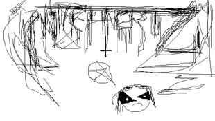
Sorted.[Edited by Ben at 18:02 on 31/01/13] -
[17:33 on 31/01/13]
-
-
-
 Amy B
Amy B - Good to see you haven't lost your paint skillz Pete
-
[17:43 on 31/01/13]
-
-
-
 Pete
Pete -
lets do the logo the old fashioned stoner rock way...
girl and car
no, girl and bike
naked girl and bike
sorry, naked chick and bike
got it - naked chick and chopper!

[Edited by Pete at 18:21 on 31/01/13] -
[18:21 on 31/01/13]
-
-
-
 mike
mike - Hahhaha, I've got an idea that I'm going to try and produce this weekend.
-
[18:44 on 31/01/13]
-
-
-
 Gareth
 -
mike says:Hahhaha, I've got an idea that I'm going to try and produce this weekend.
I so wish you were the happy dog in your picture Mike. -
[19:04 on 31/01/13]
-
-
-
 pull-my-plonker
 -
Gareth says:mike says:Hahhaha, I've got an idea that I'm going to try and produce this weekend.
I so wish you were the happy dog in your picture Mike.
Erm, you mean Mike's not a back lab?!!! -
[21:35 on 31/01/13]
-
Forums - General Chat - New look ninehertz
